
WOpet Pet Feeder App Redesign
WOpet

Project Overview
A redesign project with an existing pet feeding app, WOpet.
It was a solo project that took over two weeks.
The challenge was understanding WOpet users' responses to the current mobile app, discovering pain points, and proposing a design solution to improve their experiences.
First, I observed the current WOpet App and analyzed the numerous factors that make the app less desirable.
Research & Analysis

I found many blank spaces and an FAQ section that was difficult to navigate and understand.
Lack of User Engagement

User Confusion
Several of the icons had unclear purposes. The "Feed Settings" section and the settings icon on the machine settings page confused users about what the icons would do.

Mis-matched Aesthetics
The application's visuals are too dreamy and do not match the image and purpose of the application, which is pet feeding.
Next, I wanted to research what users would expect from a pet feeder app. I interviewed seven users of comparable applications.
Here are my three main findings on frequent user behaviors on the apps:
Users' primary purpose was to schedule the feeding time, the most frequently used feature.
Users wonder if the pet feeder is working consistently, worrying about their pets.
Another reason to open the app was to spy and take pictures of their pets using the camera.
I created a persona targeting users who have pets and care for them to meet their needs and create a seamless user experience.
Persona

Keywords: 30 years old, married, no kids, Los Angeles, $140K
About: She adopted two cats four years ago and works as a graphic designer in a company. She sometimes has to travel due to work. She loves her cats and misses them every single minute.
Frustrations:
Unable to set a repeating feeding schedule.
Struggles sometimes to change the feeding portions on the app.
Goals:
To be able to travel and leave her cats without worrying about them.
To spy on her cats anytime and to have a healing time while using the app.
Carolyn Dove
Defining Goals
My goal for the WOpet redesign project was
Make an intuitive app that users know what to do without having to explain it to them
Increase engagement with the app
Make users feel comfortable with any technical issues with the feeding machine
Make users feel comfortable on long-distance trips
Iterations
Design Solution
Simple Navigation
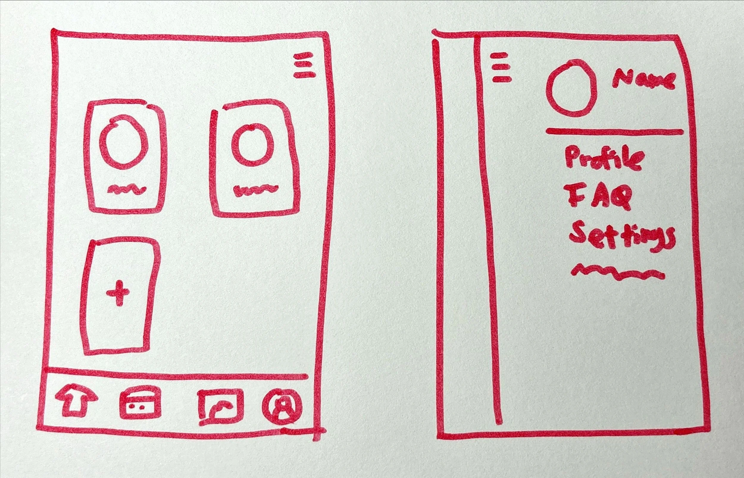
I created four essentials on the bottom navigation.
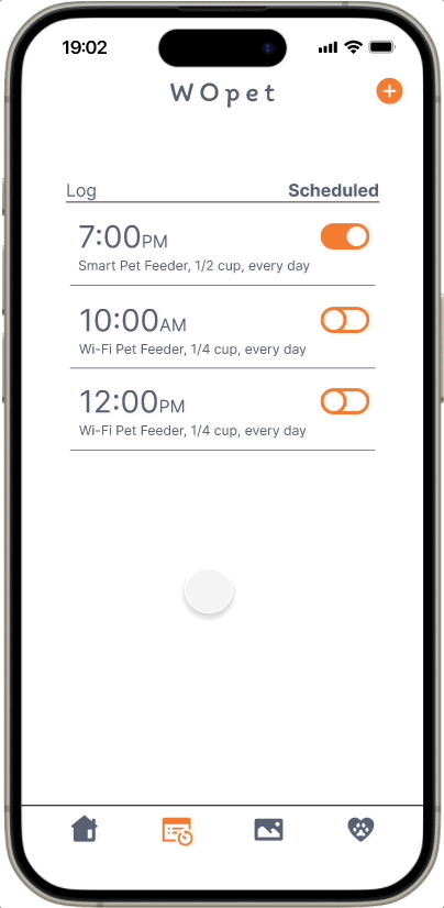
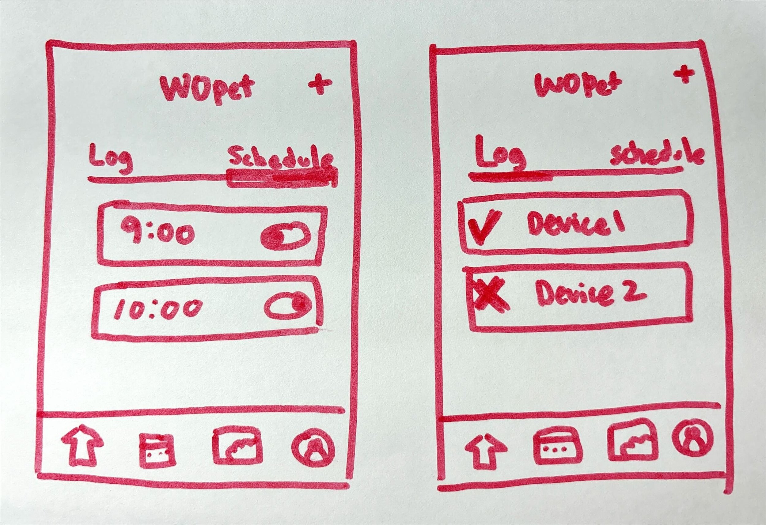
All feeding-related tasks are organized under the Schedule & Log page.
Repeat schedule, low food indicator, and portion change features simplify scheduling and provide essential alerts.
The Log tracks feeding activity, ensuring pets are cared for.
Schedule & Log
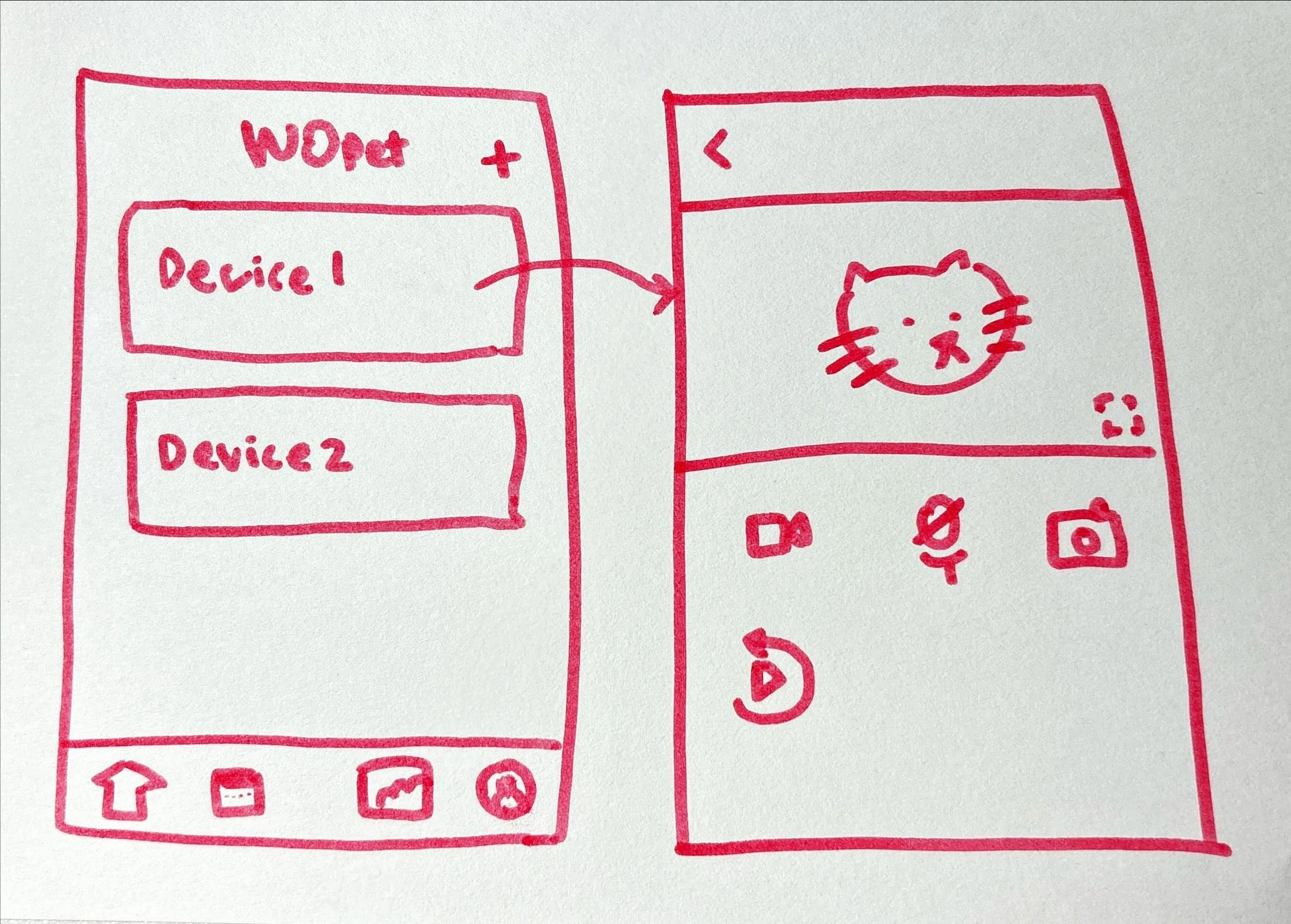
Machine Management and Live Camera
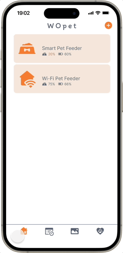
The home navigation allows users to access all physical devices, such as feeders and cameras.
The home page displays registered devices, battery levels, and food percentages.
Clicking on a device opens a live camera feed with playback capabilities for monitoring pets on long trips.
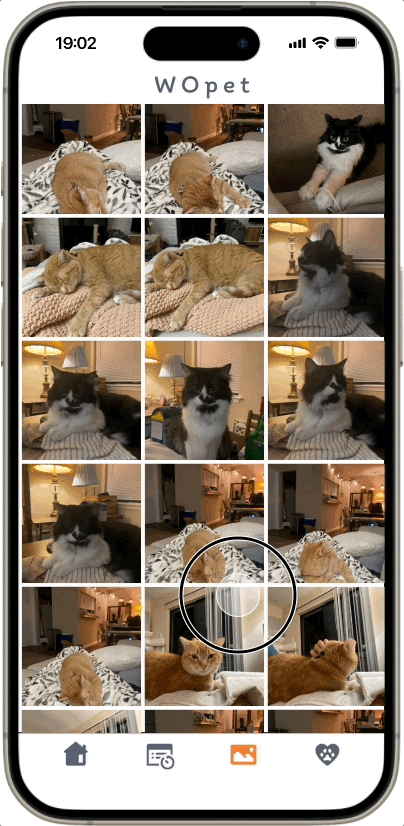
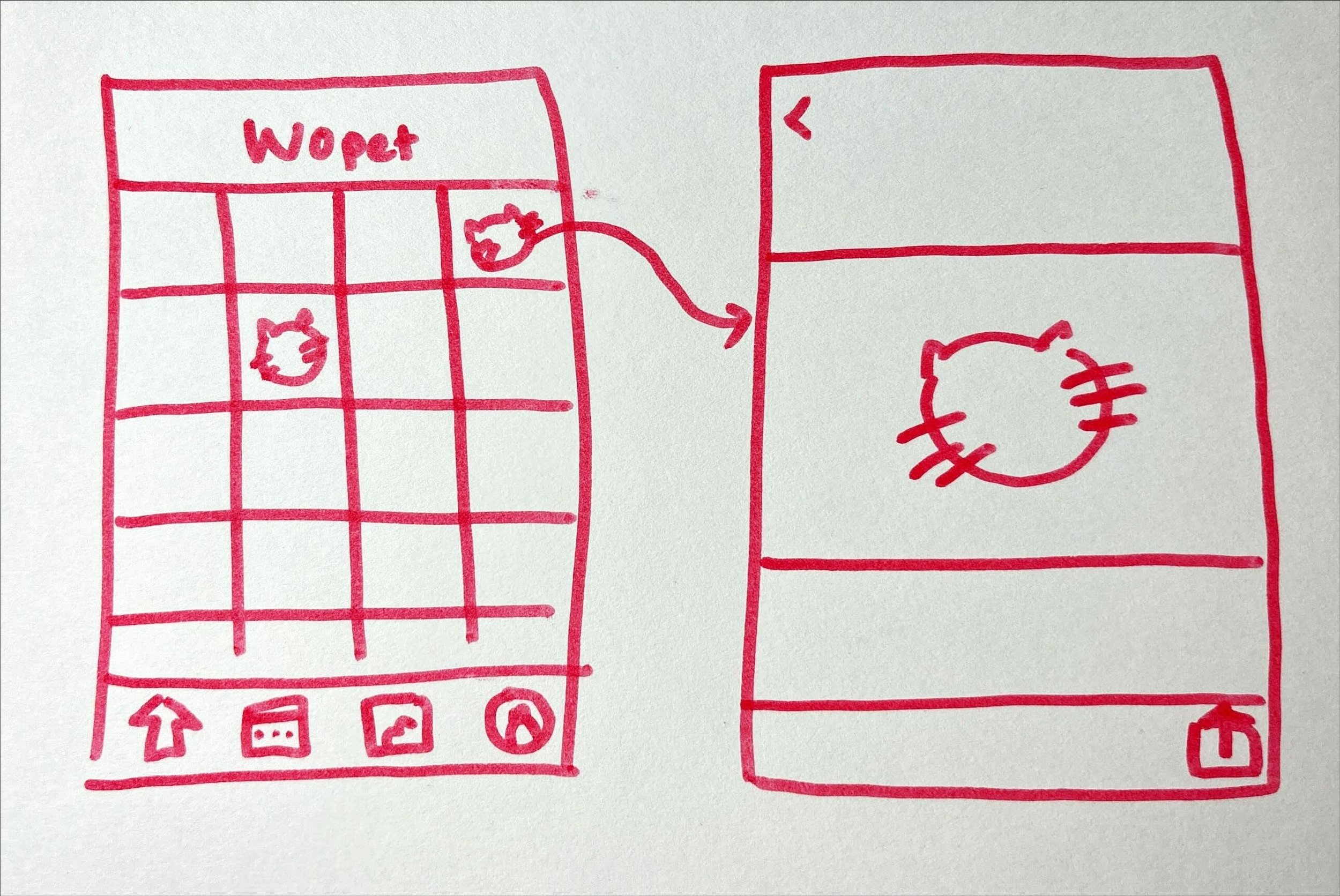
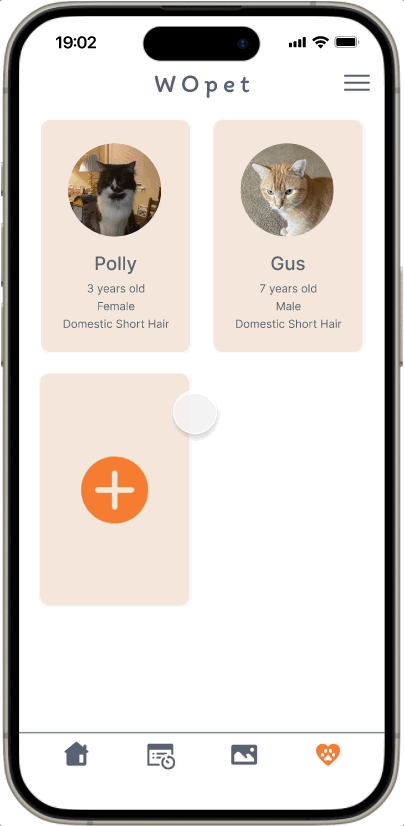
Gallery and Pet Profiles
A gallery page displays all photos and videos taken with the camera, enhancing user engagement with the app.
Users can also set up pet profiles and add notes, making the app more personalized.
Saving User Data and Photos with Login
With login enabled, users can save their information, including registered feeders, feeding schedules, pet photos, and profiles.
Impact
The redesign made the app more user-friendly and engaging.
Users feel more confident knowing they’ll be alerted to technical issues, ensuring their pets are well cared for.
With thoughtful use of white space, users can explore easily, and the overall design creates a strong, personal brand identity.


