Menu Redesign
Transforming to Cohesive Layout
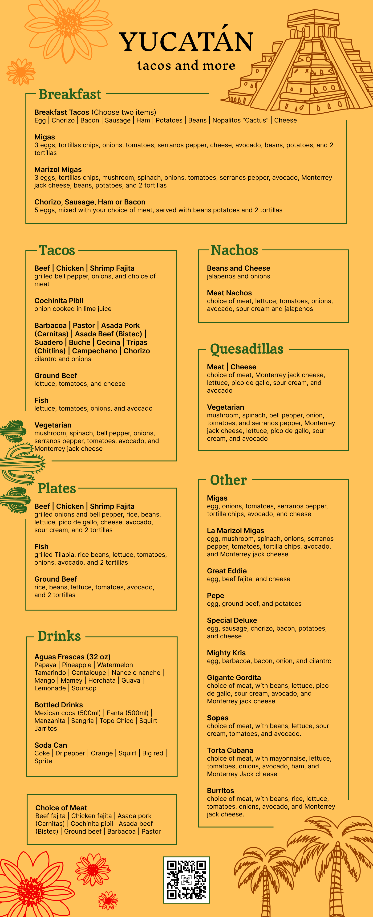
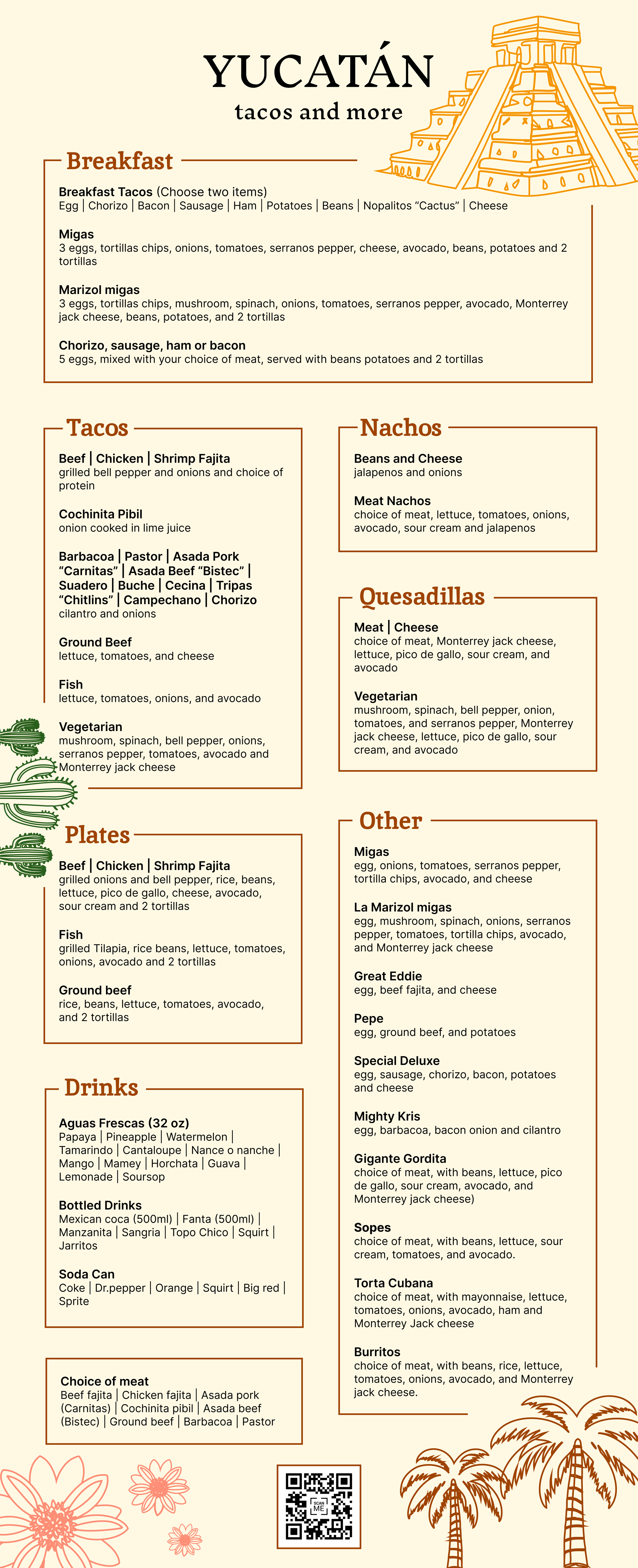
Yucatán
Project Overview
Yucatán Tacos and More is a food truck located in Austin. It faces some issues with its menu presentation.
Lack of cohesion: one category does not fall into one page, leading to customer confusion.
Irregular font sizes add to the inconsistency.
Multiple pages make it challenging for customers to navigate.
My challenge was to redesign the menu complementing these issues.

Research
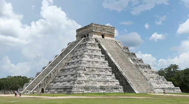

Yucatán is one of the states in Mexico. It is known for its Powdery Beaches and Mayan Ruins. The Chichén Itzá Pyramid is one of the landmarks in Yucatan.


This is the logo of the food truck.
I found out they want to project regional characteristics to the food truck.
Defining goals
My main goals for this project were:
Create one cohesive menu
Use consistent font sizes
Incorporate cultural identity
Add a QR code for dark night
Iterate
Impact
I redesigned the menu with a cohesive layout and a cultural color scheme reminiscent of Mexico Street, improving readability and user experience by re-categorizing items and adding QR codes.
I also developed a strong cultural brand identity using historical geological icons such as the Chichén Itzá Pyramid, cactus, and palm tree using Illustrator.
This project provided valuable experience in supporting local restaurants that lack sufficient design resources.