
Accessibility Case Study
Identifying A11y Issues and Strategic Approach

Project Overview
This project identifies and addresses accessibility challenges in self-order kiosks and online ticketing websites to create a more inclusive user experience.
By comparing two scenarios from the physical and digital worlds, insights were gained on how accessibility barriers manifest in different contexts, leading to strategic, interdisciplinary solutions.
These improvements enhance usability for mobility-impaired, visually impaired, cognitively challenged users, and older adults.
Physical World A11y Issue
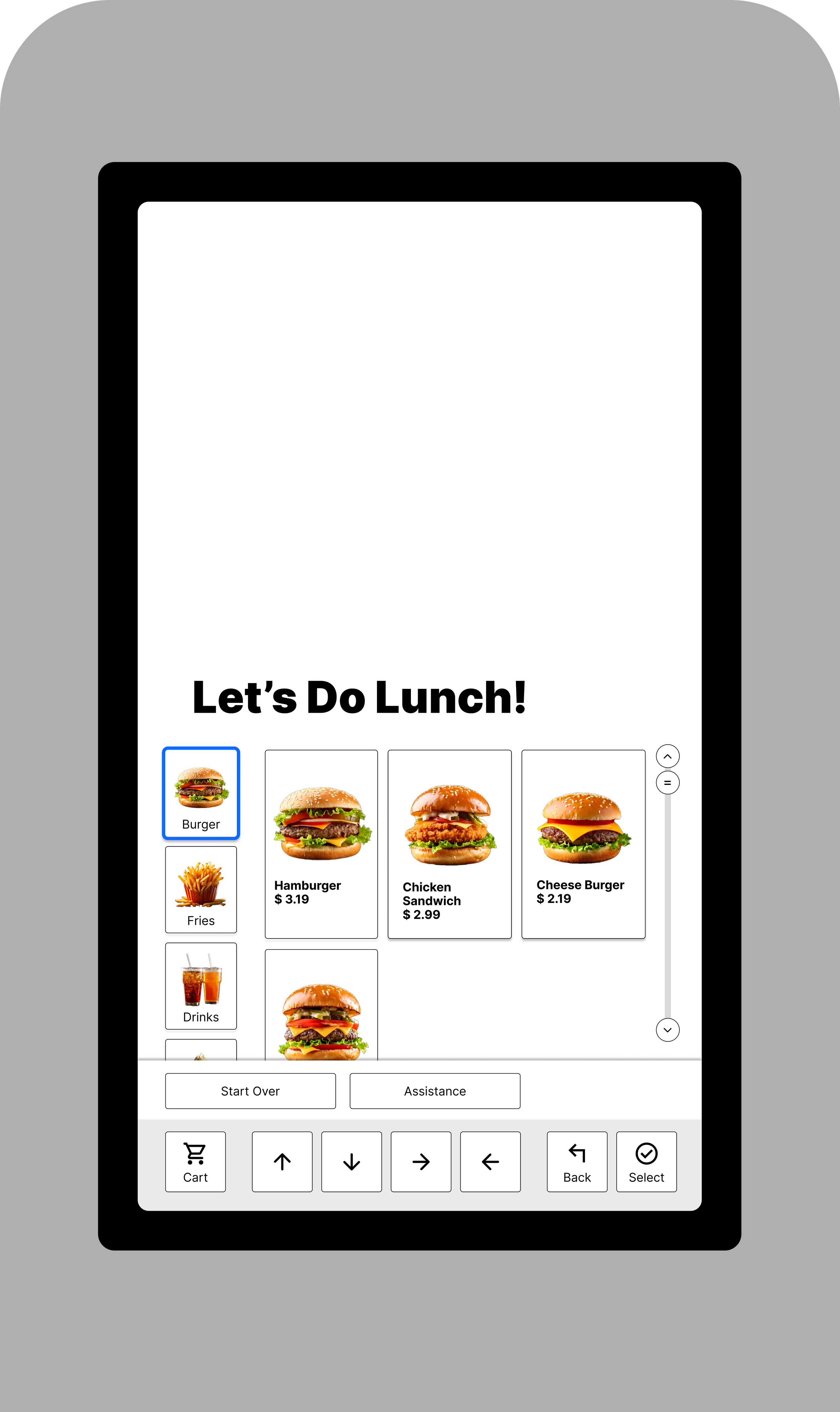
Case Study 1: Self-Order Kiosk
Self-Order Kiosks
Self-Order are self-service touchscreen systems used for ordering food. They are primarily designed for fast, visual interaction, emphasizing efficiency and simplicity in the ordering process.
However, these kiosks often lack alternative input methods and adaptable physical designs, which can create accessibility challenges for some users.

Issue Overview

Fixed kiosk height

No voice command or audio prompts

Complex multi-step ordering
Who Is Affected?
Mobility-Impaired Users

Mobility-Impaired wheelchair users struggle with high-mounted screens and small touch targets.
Cognitive Disabilities

Users with cognitive impairments get overwhelmed by multi-step processes and unclear instructions.
Visually Impaired Users

Difficulties arise when interfaces lack high-contrast elements and proper screen reader support.
Older Adults and Seniors

Seniors who are not familiar with modern self-service technology find the system intimidating and confusing.
What Can Be Done?

Lower the touchscreen to the bottom half of the kiosk and include arrow-touchscreen buttons for easier navigation.
Ensure users can move through options using arrow controls on the bottom and select items.
Build the kiosk so that the operable parts (e.g., touch screen, buttons) are installed at a fixed, ADA-compliant height, ensuring that the top of these parts is no more than 48 inches above the floor.

Add arrow buttons that provide voice guidance, offering audible cues to navigate both the digital interface and physical elements.
Include a headphone jack, like ATMs, for private audio access and improved usability.

Manufacture and deploy only accessible kiosks that meet or exceed ADA and inclusive design standards, ensuring equal access for all users.
Approach by Discipline
UX:
Conduct user testing with target groups
Create wireframes and prototypes for a “guided ordering” mode
Design:
Develop clean, accessible visual layouts
Collaborate with industrial designers on physical kiosk adjustments
Research:
Gather qualitative feedback and benchmark against best practices
Content:
Write clear, concise instructions and error messages
Develop audio scripts for voice guidance
Front-End-Development(FED):
Implement ARIA roles, keyboard navigation, and voice command integration
Ensure responsive, accessible coding standards
Interdisciplinary Coordination
UX & Front-End Development (FED) Coordination (Digital UI)
UX designers provide detailed wireframes, interactive prototypes, and user research reports.
Design & Industrial Partners Collaboration (Kiosk Manufacturing)
Design team finalizes the visual and interaction design, incorporating ADA-compliant features (accessible height, tactile cues, Braille labels).
Share design specifications with industrial designers and kiosk manufacturers.
Schedule on-site or virtual reviews to verify that manufacturing plans match design requirements.

Content & UX Collaboration
Content strategists draft clear, concise instructions and voice guidance scripts.
FED reviews technical requirements (e.g., ARIA roles, keyboard navigation) to ensure feasibility.
UX team integrates these scripts into the digital prototypes and reviews placement within the user flow.
Conduct joint review sessions to adjust the design based on technical constraints and test outcomes.
Test the integrated content with real users and refine the language based on feedback.
Digital World A11y Issue
Case Study 2: Online Ticketing Websites
Online Ticketing Websites
Online ticketing websites allow users to purchase event tickets through interactive platforms.
However, many rely on highly visual, dynamic interfaces that can be challenging for a diverse user base. Complex seat maps, rapid checkouts, and visual clutter may hinder usability for many.


Issue Overview
Visually complex seat maps: Relying solely on graphics without accessible text alternatives.

Overwhelming visual clutter: With small clickable areas and non-linear navigation.

Fast-paced checkout processes: Requiring rapid interactions that can overwhelm users.


Who Is Affected?
Individuals have challenges with small or densely packed clickable areas, making precise selections difficult.
Mobility-Impaired Users
Users with cognitive impairments can be overwhelmed by countdown timers and increase pressure.
Cognitive Disabilities
Struggle with dynamic, image-based seat maps that lack text alternatives and clear labels.
Visually Impaired Users
Seniors who are not familiar with modern self-service technology find the system intimidating and confusing.
Older Adults and Seniors
What Can Be Done?

Provide an accessible list view with text-based seat options, allowing users to navigate easily with a keyboard or assistive technologies.

Include filters for price, section, and accessibility features to simplify selection and ensure equal access.
Streamline steps and remove unnecessary time pressure with adjustable countdowns.
Deploy a fully accessible online ticketing platform that empowers all users with seamless, intuitive, and independent access.
Approach by Discipline
UX:
Conduct user research and usability tests.
Develop wireframes offering both graphical and text-based seat selection with clear, step-by-step navigation.
Design:
Create a high-contrast, clean interface.
Design dual modes (visual map and list view) that are familiar and intuitive.
Research:
Gather quantitative and qualitative data.
Benchmark against WCAG/ADA guidelines and iterate based on user feedback.
Content:
Write clear, jargon-free instructions and error messages.
Develop accessible voice guidance scripts.
Front-End Development (FED):
Implement accessible coding practices (e.g., ARIA roles, keyboard navigation).
Seamlessly integrate voice commands and responsive design.
Interdisciplinary Coordination
UX & Front-End Development (FED) Coordination (Digital UI)
UX designers provide detailed wireframes, interactive prototypes, and user research reports.
Design & Content Coordination
The Design and Content teams establish unified visual and messaging guidelines for accessibility.
They create integrated assets where visuals and text work harmoniously for clarity.
Both teams review and refine these assets to ensure a seamless, low-cognitive-load user experience.
Research & UX Coordination
Research and UX team develop a testing framework aligned with WCAG/ADA standards.
FED reviews technical requirements (e.g., ARIA roles, keyboard navigation) to ensure feasibility.
They execute structured usability and accessibility tests with target user groups.
Conduct joint review sessions to adjust the design based on technical constraints and test outcomes.
Research and UX analyze feedback, report findings, and drive iterative improvements.
Self-Order Kiosks vs. Online Ticketing Websites
Summary & Findings
Summary
Aspect
Description
Challenges
Affected Users
Solutions
Limitations & Difficulties
Physical vs. Digital
Inclusive Interaction Methods
Cross-Disciplinary Collaboration
Self-Order Kiosks
Self-service touchscreen ordering system used in fast-food restaurants.
High-mounted screens, small touch targets, and complex multi-step processes.
Mobility-impaired, cognitively challenged, visually impaired, and older adults.
“Accessibility Mode” with simplified navigation, fixed ADA-compliant physical design (tactile cues, Braille labels), and integrated voice guidance.
• Physical retrofitting can be costly and logistically challenging.
• Integration of physical modifications with digital interfaces may require extensive coordination and redesign.
• Higher maintenance and operational costs may arise from constant hardware updates and compliance requirements.
Self-Order Kiosk combines physical design modifications with digital enhancements
Online Ticketing Websites
Digital platforms for purchasing event tickets featuring interactive seat maps and rapid checkouts.
Dynamic, graphical interfaces with visual clutter and time-sensitive checkout processes.
Blind/visually impaired, cognitively challenged, mobility-impaired, and older adults.
Alternative text-based list view for seat selection, streamlined checkout with extended time options, and integrated voice commands.
• Implementing alternative navigation modes (like text-based views) may require substantial redesign of existing platforms.
• Ensuring consistency across devices and browsers can be complex, leading to increased testing and iteration costs.
Online Ticketing Websites focus solely on digital interface improvements.
Both scenarios benefit from alternative input modes (e.g., voice commands, large buttons, clear navigation) that support diverse user needs.
Both require coordinated efforts among UX, Design, Research, Content, and FED teams to effectively meet accessibility standards.


